
IDENTITY—MARKS
Mastering the all-important first impression.

“From tiny acorns mighty oaks do grow.” The Winslow Media mark reflects this small-but-powerful mindset along with a gentle Southern sensibility in its lazy curves and flowing lines.

Based on a formal garden, this mark for LSG Landscape Architecture combined an earthy color scheme with strongly geometric shapes to communicate the highly intentional planning that went into developing outdoor spaces.
Comfortaire’s new air bed topper, Serafoam, was designed to deliver heavenly comfort. The concept found expression in this angelic “S,” featuring Spencerian curves and complete with halo.

Accolade was formed to provide consulting resources to businesses on demand. With Accolade as the hub, the team is an integral part of the client.


For a line of outdoor power equipment, the Fusion mark evokes gears and chainsaw teeth while inviting customers to connect the dots, and combines a capital “F” with a graphic depicting fusion.

Used by the Myrtle Beach Chamber of Commerce to certify member participation, this mark featuring sun and palm trees was perfect for the familiar coastal destination.
For Equifirst, a top 20 US subprime mortgage lender, colors unique to mortgage lending were used in a mark based on “e” letterforms that came together in a visual metaphor for a house.

Developed for a unique practice that combined pediatric and adult podiatric care, this mark made meaningful use of negative space to show exactly where Carmel Podiatry stood (pun absolutely intended).


Flowing lines and muted green tones elevated the lowercase “e” letterform into an iconic leaf shape that evoked a sense of natural ease for Esterna’s line of outdoor furnishings.
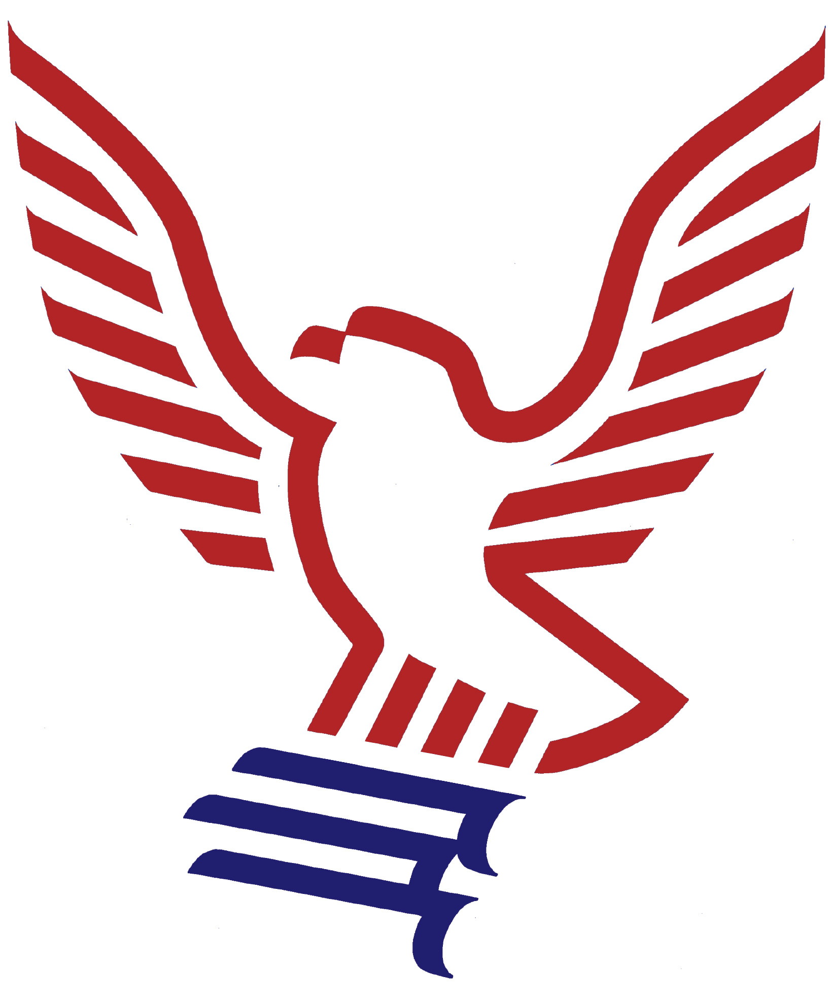
Featuring an eagle built from the stripes of the American flag and bearing scrolls in its grasp, this red, white and blue mark unmistakably reflects Foundation America’s mission to provide education and support for the U.S. Constitution.